Website creativity is important and can boost your website’s ranking and performance. Just don’t let website creativity get in the way of your users’ experiences.
In website development, it’s important to keep in mind that your site is essentially a document, or series of documents, that your visitors will be reading. Understand that this is the expectation they’re coming to your website with as well.
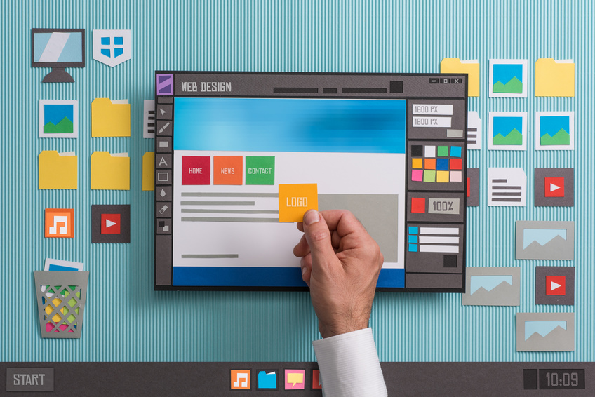
Website Creativity
As the internet has become more sophisticated and web use has increased, visual marketing has become more important as well. Marketers, advertisers, and designers are now creating and relying on visuals more than ever. And it looks like the trend will just keep rising in popularity and effectiveness.
However, just because visuals and images are proven to be effective marketing tactics, doesn’t mean you should forgo text based information. People still read to gain information and many times, visuals cannot convey the full breadth of an idea like the good ‘ole fashioned written (or typed) word. If you’re going to use visuals on your site, make sure they’re beneficial, and not hindering your web success.
Don’t go overboard with website creativity and visuals on your site! You may think they look cool and are attention grabbing, but the truth is, a heavy visual site will only drive people away. Modern internet users don’t want aggressive moving images popping up as they scroll or automatically playing animations. It’s fine and maybe even beneficial to include some visuals, but there is a definite line in the sand.
Keep reading to determine what side your site is currently on! Make sure you’re on the right side.
Website Layout Tips
If you’re going to create your own website or even just an article post, you need to pay attention to how you lay it out. After all, presentation is half the battle! Keep these 4 layout tips in mind as you design your page.
1. Make sure your most important information is above “the fold”, most searchers wont read below that on a webpage. In fact, a Neilson Norman Group research study found that web searchers spend about 80% of their time above above “the fold”.
2. Use vibrant, appealing visuals. Visuals impact a user’s decision and association of a product or service. Like it or not, your viewers are judging a book by it’s cover.
3. Favor the left side in your design. A study has concluded that viewers spend 80% of their time on the left side of a webpage, rather than the right. This may be because we read English from left to right, but whatever the reason, our eyes automatically drift to that side.
4. If your image depicts a person, pay attention to their eyes. Your viewers will subconsciously follow the path that the image directs them towards. Use that to your advantage to point out an interesting fact or a promotion!
Important Statistics
59% of online shoppers want MORE product information, not less. Research has shown that viewers are 84% more likely to purchase a product after watching a product video. In an ecommerce situation, a product image or video is enhanced by content and text based information surrounding it. Think about some big online retailers like Dick’s Sporting Goods or Apple. They have their product image and maybe even a supporting video, but then they have a good chunk of content devoted to explaining the features and what the product is.
In addition, website visitors demand speed and gratification. 40% of Internet users will leave a web page if it doesn’t load quickly. A webpage burdened down with complex images and long videos significantly slows a page’s load time. Make sure the visuals you have on your page are worth the load wait. The common statistics is that you have 8 seconds to capture a searchers attention before they leave your page.
Use this Google PageSpeed tool to check your page speed and optimization! Your website creativity could be slowing your site down more than you think!
Keep The Content
Words are the most powerful communication tool known to mankind and the Internet is the great facilitator of this tool. In his somewhat eclectic, yet enlightened book The Medium Is the Message, author Marshall McLuhan stats, “Western history was shaped…by the introduction of the phonetic alphabet, a medium that depends solely on the eye for comprehension…” In the words of Yvonne DiVita, book publisher, author, and social media expert, “Words count! The Right Words Count Double!”.
With the rising popularity of social media platforms like Instagram, Pinterest, and Snapchat, it’s easy to assume that text is falling by the wayside and visitors are only interested in images and pictures. That couldn’t be farther from the truth.
Yes, visuals add value to your site and should be invested in, but content is, and will always be, your most reliable marketing resource. For every visual you use, add (at least) a paragraph of content. Regular text will never lead to an out of date link, it loads faster than images and videos, and can be more easy changed, updated, and transferred. Especially since AMP pages are becoming more popular now, simpler pages are becoming crucial for web-traffic purposes.
All of the rules of good typography still apply. Keep these in mind as you develop your web content. As an example, bolded text and differing fonts command attention. Study which fonts are most effective and pair well together to draw the most amount of attention. Get friendly with spacing and establish a set number of stylistic designs you intend to use to achieve visual balance in your content.
Don’t forget to include your target audience expectations and needs in your content designs! Older audiences may require larger font size with simpler styles, while younger generations may be more drawn to creative designs.
Two Requirements for Web Content
As you develop your web content, there are a couple other basic concepts for you to keep in mind. First, be thorough but concise! In most cases, less is more! Don’t say in two paragraphs what you can say in ten words. Your website is not the place to practice hitting a word count.
The reason the user came to your site was to have their question(s) answered; don’t disappoint them with a long-winded, round about answer. We criticize our politicians of this same act all the time, and for good reason too. Many times if an individual is unable to give specific answer it means their either lying or don’t really know what they’re talking about. You don’t want to leave that impression on your site visitors, so just give them what they’re searching for!

However, don’t take this to mean you should only be publishing short web pages. As I said before, be thorough! The best performing blog pages on the web are 2,000 words or more. There are a few reasons for this. Longer content means more real estate for SEO keywords, but it also means the author is able to answer the question or problem fully and give ways to solve it, making the page popular among web searchers.
Many successful blog posts and webpages include several visuals as well. These visuals always help the viewer either understand an idea that is written or is related to the content in some way. Images and videos help the eye to move easily through content and keep the viewers attention on your page.
Second, the content of your website should reflect the real and measurable benefits that you provide to your customers. Your content is the first interaction you have with a potential customer. In other words, your content should exemplify the unique value of your business to serve customers and solve their pain points, NOT about how amazing your company is. The more you can build on your unique qualities and their benefit to your customers, the better.
A Tale of Caution
Recently, a web designer colleague called me up excited to show me a website that he had just developed. When I got to his office and saw his latest masterpiece I was a little concerned. He had indeed developed a magnificent dynamic, database driven website. Unfortunately, at his customer’s request, he had also developed a 2 minute long Flash animation. This was the first thing a web visitor encountered when they went to this particular company’s homepage.
I stood there watching this spectacular high-bandwidth display of color and motion, while my friend basked in the glow of his creation. My only thought was how absolutely annoying this was going to be for just about every single web visitor that came to this particular website.
Be mindful of how your webpage will look to a new and repeated site visitor. Take a break from your design and give it fresh eyes the next day. Does it still look good or is it in fact a little jarring?
In Conclusion
To compete on the modern internet, you need to include a variety of visuals on your webpages, but once you start, it’s easy to get carried with website creativity. Be aware of the impact your visuals have on your customers and your website load time as well. Your desire for visual website creativity may be pushing away more visitors than it attracts.