
Having a website that prioritizes mobile page speed is increasingly important. For small businesses, creating mobile friendly websites can be challenging, especially if there isn’t a set position within the business for content management. But, if you do want to grow your business, you absolutely need to optimize for mobile search.
Not a pro? Not to worry! The following list of tools and tips will help you make sure your website and webpages are optimized for mobile search.
Is Mobile Page Speed Really That Important?
The short answer, yes. Why? More and more people are using their smartphones to do online searches, and the majority of younger generations only use mobile. You need to optimize your website for how your potential customers and clients are searching for you.
According to Search Engine Land, 74% of people say they will return to a mobile friendly website, and 52% of people are less likely to engage with a business at all that isn’t mobile friendly.
Google rolled out their first list of mobile friendly ranking factors back in 2015 and has been continuing to emphasize it since. Some of those ranking factors include image load quality and time, already mobile-optimized websites, equal desktop and mobile website versions, and quality of mobile site.
Luckily for you, there are plenty of tools available to you to make sure your mobile site is ready to go!
9 FREE Tools to Make Sure Your Website is Mobile Ready
In a great article by Brian Dean, he lays out 8 mobile SEO tools you can use to take full advantage of mobile search and how to optimize every one of your webpages for mobile search.
Whether you’re a B2C or a B2B small business, a mobile optimized website has the potential to dramatically increase your website and in store visits, driving your sales and revenue. Regardless of your specific target audience, you’ll want to optimize for mobile to make yourself and your business available to the majority, rather than the minority.
1. Mobile Usability
If you don’t yet have a Google Search Console account set up, you need to do it! It’s free and Google provides you with some great resources to optimize several different facets of your website.
So, to check your mobile standing, here’s what you do:
- Log into your Google Search Console
- Select “Search Traffic” on the left hand column
- Under “Search Traffic”, select “Mobile Usability” in the drop down menu
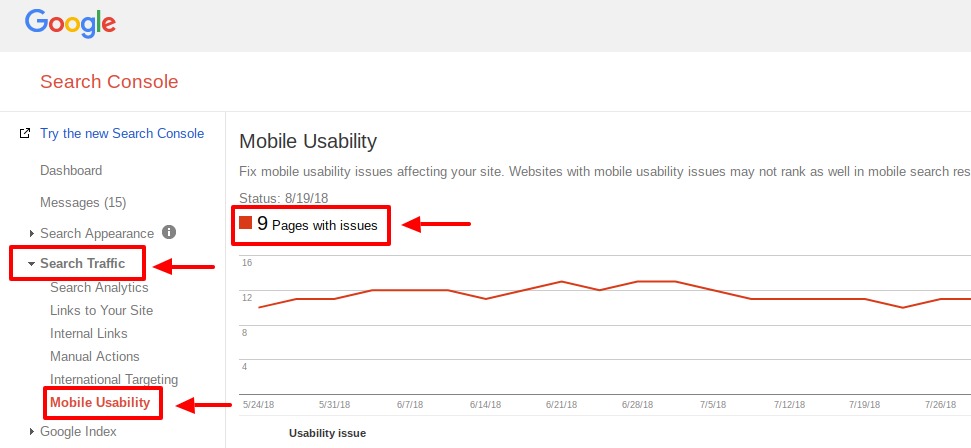
Once you do that, you’ll be able to see the amount of mobile issues you have with your website and what those specific problems are. If you select the issues Google has listed, Console will also provide you with a list of specific webpages that are causing your mobile rank to decline. Being aware of what specific pages are the problem is half the battle in optimizing for mobile.
2. Fetch as Google
The Fetch as Google tool is another great resource that can be found in your Google Search Console. Here’s how you get to it:
- Log into your Google Search Console
- Select “Crawl” on the left hand column
- Under “Crawl”, select “Fetch as Google” in the drop down menu
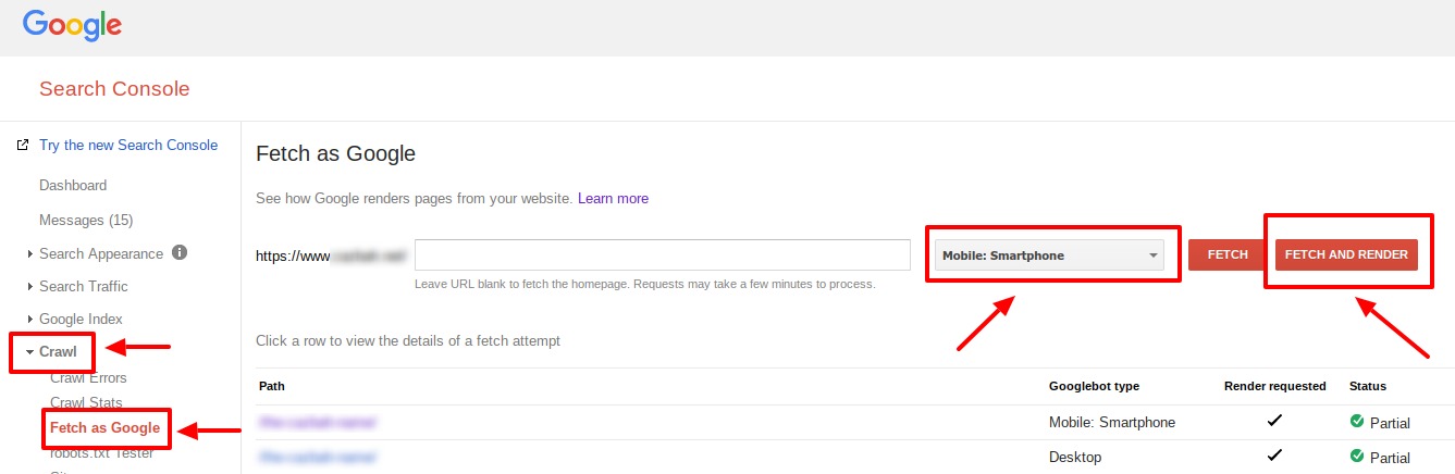
At the top of the page, you have the ability to search on individual pages by adding the ending URL of any webpage on your website. Next to the URL space there is a drop down menu. Make sure you select “Mobile” in the drop down menu. Next to that are two buttons you can select “Fetch” or “Fetch and Render”. You want to select the “Fetch and Render” button. This option will show you how Google sees your webpage and how a visitor to your site would see your website on their smartphone. You can compare both side by side to make sure they’re the same and nothing from your desktop version of the page is missing.
3. Google’s Mobile Friendly Test
Google has a few mobile optimization tools for you to use and Google’s Mobile Friendly Test tools is perhaps the easiest of them all. You can use this tool to check the mobile optimization level of a specific page by simply entering that page’s URL.
This tool will just come right out and tell you if your page is mobile friendly or not. It provides a mock up of how your page appears on a common smartphone and also provides you with a few other resources to check out!
4. Mobile Responsiveness Test Tool
This mobile response test tool was created by Matt Kersley and is free to use! This tool is designed to help you see how your website appears on different size screens. You’ll be provided with comparative visuals on how a specific page will appear on an iphone vs a tablet.
While it is important to optimize for mobile, do realize that has different meanings to different people. Not everyone will be using an iphone 7 to search your website. People can use tablets, ipads, iphones, and androids to search online, so you want to make sure your webpage looks good and is easy to navigate across all mobile search devices.
5. Page Speed Insights
With page speed insights, you guessed it, you can check your mobile page speed load time and also your optimization rating for both mobile and desktop. It also gives you a clear page rank for speed and optimization for mobile and desktop to see how you compare. Google let’s you know what areas on your webpage need improvement and gives you resources where you can get some answers on how to speed up your pages.
6. Web Page Test
This web page test tool allows you to test any URL’s page load time and overall mobile optimization, but that’s not even the cool part. What’s unique about this tool is that you can check your URL’s mobile optimization from different smartphones (apple or android) and from different locations too! So if you’re an international business, or do a lot of business in a particular location, you can mimic a test a see how well your webpage is optimized for mobile search in that area on a specific type of device.
7. Test Your Mobile Speed
Test your mobile speed is yet another free tools Google gives out. Using this tool, you can check your website’s load time (and how Google ranks it), see an estimated number of visitors lost because of load time, see a comparison of mobile load times within your industry, and see some improvements you can make to save some load time.
You also have the option to get a free report from the test to dive a little deeper.
8. AMP Pages
AMP pages are becoming increasingly popular because they focus on page load time first, and design second. By prioritizing speed, AMP pages are structured to load content so searchers don’t have to wait as long. However, it also does load images and other media you may have on a page.

If you use WordPress to create webpages for your small business website, there is an AMP plugin you can download which automatically converts your pages to AMP style pages. These faster loaded AMP pages will generally appear at the top of SERPs because Google prioritizes speed as a ranking factor.
9. Orbit Local Speed Test
Orbit Local has recently developed a free bulk speed testing tool that can check the mobile and desktop speed and your core web vitals. This tool can measure up to 500 pages at once.
Using Core Web Vitals check helps you determine which pages on your site need the most work. It can spot slow pages that you’d not be able to find with other tools unless you check each URL one at a time. As a bonus, you’re also running the Google page speed test at the same time, so you make sure your pages load fast. You can also use this tool to compare your website to your competitors.
In Conclusion
Mobile page speed optimization is a reality of modern business, both big and small. The ways in which people are connecting with businesses has dramatically changed and small business models need to reflect that. Optimizing your website and webpages for mobile search will ensure online searchers stay satisfied and move to become your customers.
 Blog
Blog Case Studies
 Infographics
 Free Comprehensive Analysis