
Does your small business have a mobile friendly website? Are you wondering what that even is?
Responsive, mobile optimized websites are now the norm for the online search community. Mobile search is rapidly overtaking desktop search for many websites and markets. If your small business has yet to optimize for mobile, you need to make that a priority right now! You could be missing out on valuable traffic and conversions.
Take a look at this article to learn what you need to do to make your website mobile friendly and how to test it using Google’s own tools!
Why Having a Mobile-Friendly Website is More Important Than Ever
Google announced, “Starting April 21, 2015 we will be expanding our use of mobile-friendliness as a ranking signal. This change will affect mobile searches in all languages worldwide and will have a significant impact in our search results.”. This change and the corresponding algorithm updates is Google’s way of making sure they provide end users with the best internet experience possible.
Google has been prioritizing mobile optimization for user search for a while now, but not all small businesses are on board with this change yet. More and more people are using either their smartphones or tablets to search the web in place of desktop computers.
If you’re curious to see what devices your website visitors are using to search through your web pages, follow these steps:
1. Log into your Google Analytics account
2. On the left hand side navigation bar, click on the “Audience” tab
3. Under the “Audience” tab, click on the “Mobile” tab and then the “Overview” tab under that
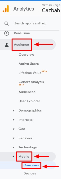
In the chart and data provided, you’ll be able to see how many of your website visitors are using desktop, mobile, or tablet devices to browse your website. This data is extremely beneficial so you can determine how the majority of your website visitors actually see your web pages and your content.
What Does a Mobile-Friendly Website Mean?
Mobile-friendliness has a significant impact on search engine rankings. How well optimized your web pages are for mobile search is a factor that Google considers when determining how high to rank your result in SERPs (search engine results pages). Mobile page speed is a huge part of mobile optimization that you’ll also need to pay attention too as well. If you’ve yet to consider mobile for your small business, now’s the time!
Here’s what you need to do to make your small business website mobile friendly:
– Test how your images appear on different sized screens
– Make sure your web pages and any plug ins you have installed load properly on various search engines like Google, Bing, Safari, Fire Fox, and others
– Don’t load down your page will large media file types (this will slow down the page load time)
If you’re uncertain whether your site is mobile-friendly, you can also check by using Google’s Mobile Friendly Website Test tool.
In Conclusion
You need to prioritize a responsive, mobile friendly design for your small business website. Mobile search is rapidly becoming the norm for many people and it won’t be long before you see it grow in popularity on your site search as well. Take a look at the tips and resources above so you can make sure your website is up to par.
 Blog
Blog Case Studies
 Infographics
 Free Comprehensive Analysis